This weekend is Wacken Open Air weekend. Unfortunately, I can’t be there this year. However, I thought I might use the opportunity to write about a somewhat related topic.
Metal band logos aren’t thought or written about a lot. Most people take them for granted without questioning what the band or their designer had in mind when they created the logo. While this is perfectly alright I think most bands have put quite a bit of thought and effort into their designs.
So, I’d just like to present a few of those logos from some of my favourite bands and my personal thoughts on them:
- Avantasia:

While rather traditional as Metal band logos go with its slightly battered look, the warm golden tones and the slight curves below the name it has a 19th century, almost a little steampunk feel to it.
- Queensrÿche:
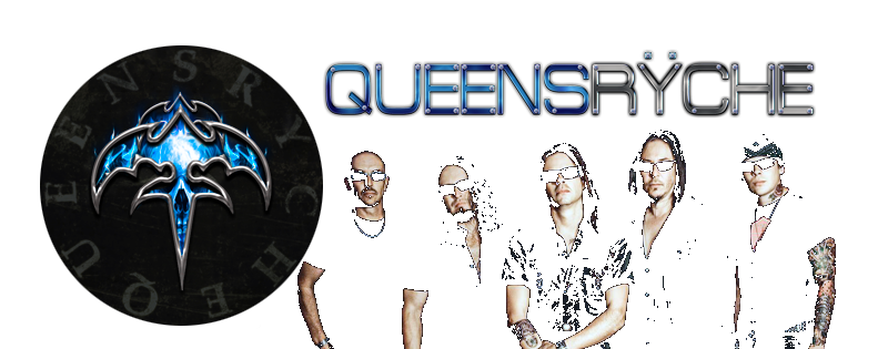
Queensrÿche’s (w/o Geoff Tate) most recent logo incarnation with its blue flames and the glowing name looks very modern, almost Sci-Fi-like. This one’s quite well-done, especially as their previous logo variations were overly complex and often overloaded with details.
- Savatage:

This one’s very 80s, very traditional. I think back then you could hardly find a Metal band that didn’t have some sort of stylized lightning in their logo. A good, recognisable and memorable logo, nonetheless.
- Saxon:

Speaking of traditional logos – Saxon’s is another one of those: Very classic, very British, very – well -Saxon.
- Blind Guardian:

This logo downright screams ’80s, Germany, Speed Metal’. However, it also fits the bands overarching fantasy motif particularly well.
- Symphony X:

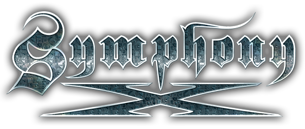
I really fancy this one because while it lives up to the bands progressive, classically-inspired music the circuitry shown within the letters is a nice nod to the iconoclast motif of their latest album.
- Honourable mentions – Dark Throne:

No article about Metal band logos would be even remotely complete without mentioning at least one of those, eerily beautiful yet mostly unreadable Black Metal band logos. This one by Dark Throne is still readable but you should get the idea of convoluted, almost branch-like white lines that can typically be found in such logos. This is a nice example of how simple black-and-white imagery can be used to invoke pictures of raw nature, gnarled trees and an uncanny wilderness.

 Deutsch
3 Comments